The «Making of» of franciscolopez.es
How this page was built
In this article you can see everything that led me to build this page: the reasoning and the process I followed to get where you are now.
A small adventure in learning and judgment, from strategy to UX, from UX to design, and from design to code.

Opening
Building with judgment in the age of AI
When I started thinking about this project I knew I didn't want a CV in HTML, I wanted a proof of judgement: in product, in the technical side and in usability. Something that showed how I work, the weight I give to design and UX, and a product-builder approach that isn't functional vibe coding riddled with technical inconsistencies and security risks. I'm a PM and I'm not trying to be anything else, but these days, without being a developer or a product designer, putting some time into it gets you work that holds up on every front.
And the most honest way to prove it is to show it. As simple as opening the workshop and showing the engine: why this page exists, how it's built, what broke along the way, and what I learned from each break.
Everything I claim below is linked to the code that backs it up. The repository is public, so you don't have to take my word for it: go take a look.
Let's get into it.
1 of 12 · 4 min
01 — Why it exists
01. A website doesn't prove judgment by existing
1 of 12 · 4 min
When I decided to take this project on, the first thing I wrote wasn't a line of code, and I didn't run user research either. What I did do was study the profiles of a few people I look up to in Product, read what recruiters write, and get two things straight: that I wanted a first version out fast, and that I wanted a site ready for the different kinds of people who were going to read it. Out of that came a written hypothesis of who reads and for how long, and every decision comes out of that hypothesis.
Two readers, two speeds
A recruiter scans for five to ten seconds and needs three facts: role, seniority, stack. A CPO or VP Product can read more slowly, and what they're after isn't facts but judgment: what you decided, with what information, and what happened next.
One text can't serve both. The fix was architectural, not editorial: the first screen passes the recruiter's filter, and the content goes deeper as you scroll. What a fast reader needs sits before any scrolling is required; what a slow reader is looking for sits below, with room to explain itself.
What those two speeds actually decided
They didn't stay on paper: they shaped the pages. The three most-read ones are all built the same way, with a summary up top and the detail underneath.
- The homepage has a safety net for the fast reader. Right below the cover come five milestones, on one screen and with no scrolling: that's what answers «role, seniority and stack» to someone who'll be here ten seconds. What follows, how I work, the track record, the tools and the training, isn't talking to that person any more: it unfolds for whoever keeps going down.
- And every experience page repeats the mechanism inside itself. The track record index links to each one, but the double reading isn't in that jump: it's inside the page. It opens with the facts of the role, and the first thing you read is "In a minute", a handful of bullets answering what I did there without having to scroll. Below that sits what a fast reader doesn't need: the story, the specific case and the takeaways.
- And the three system pages open the same way, whatever screen you're on. The Brand Kit, the Design System and the accessibility statement start with a lead paragraph and a row of key figures, and the detail comes after. That row isn't each page's own call: it's a piece of the system that exists for exactly this, so all three behave the same without anyone having to remember.
What isn't here (yet), and why
The part of product judgment that gets shown the least, though, is what's visible in what isn't there. Two absences, and neither of them is a «never»: both are waiting for data to say they're needed.
- This isn't a blog. It's a page with article structure, no post index, no tags, no feed. Setting up a blog isn't publishing once, it's committing to publish, and that commitment gets made when there's something to tell a second time and someone waiting for it. What you're reading is the first measurement of that: if this page gets read, the next decision gets made with real readers on the table instead of with enthusiasm.
- The conversational assistant is on hold, and its limit is written down before it exists: what isn't in writing on the site doesn't go into its corpus either. It's something I will build, it makes sense and it's one more proof of judgement and of AI applied, but everything in its own order: launch, metrics, then new bets.
Neither of the two is a technical limitation. They're two places where saying yes would have been the easy call, and where saying «not yet» forces something more uncomfortable than saying «no»: writing down what would have to happen to change my mind.
The rule that shaped everything else
If the site claims I know product, UX and data, the site has to be built with all three. A slow, inaccessible, poorly measured or insecure page contradicts its own text. That's what turns every technical decision that follows into a content decision.
2 of 12 · 4 min
02 — How I work
02. From brief to board, and one deploy per batch
2 of 12 · 4 min
This started the way any product starts: with a brief. Half a page answering what this is, who it's for and what it has to achieve. From there came a PRD, which isn't a ceremony document but the place where the answer to "what's this even for?" lives, for when you're three weeks deep in the code and have forgotten.
A PRD split in two
That PRD ended up outside Notion, living in the repo as a markdown file, and today it's split in two, which is one of the decisions that has aged best. A live one, saying what the product is today, written in the present tense. A historical one, keeping the dated record of every decision and why whatever got discarded was discarded. Mixing the two is what turns a PRD into a document nobody opens: once most of what you're reading is no longer true, you stop reading the whole thing, and then it stops serving the one purpose it had.
The board, and why its columns aren't decorative
The board comes out of the PRD. Every task carries its scope, dependencies, size and notes, and those notes are where I write the why while I'm still thinking it through, not afterward. The statuses aren't there for show either:
- Not started, for everything not yet committed.
- Pending, in progress and blocked, the three reserved for the active stage. No task from a future stage can sit there.
- Done, only for what's finished in that stage.
- Archived, where everything moves once a stage closes.
That last column is what keeps the board readable: if finished work stays visible forever, in two months the board is a museum.
Two boards, because they're two questions
Tasks aren't ordered by whim. They're linked to a separate prioritization board where they get tagged with MoSCoW: must, should, could, won't. The two boards answer different questions, which is why they're kept apart: the execution board says what order things happen in; the prioritization board says why that order. Merging them turns every priority review into an argument with myself about whether to move a card.
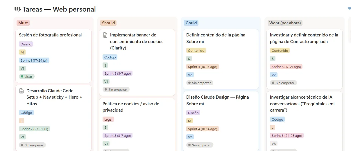
No dates
What's missing is dates. I started out using them, then quickly realized dates on a solo personal project are fiction, and fiction that also needs updating every week. What drives execution is three other things:
- Whether something is a must or can wait.
- What order it goes in.
- How big it is.
There are two fields people always mix up, and separating them is what made the board usable. One answers "is this committed, or is it waiting?" The other answers "which release does it ship in?" They're different questions: a task can be committed for the next stage and still ship in a later release, and conflating them turns the board into a wish list sorted by optimism.
There's also a lane that runs ahead of the rest, and it's content. On pages that depend on text only I can write, the text is the real bottleneck, not development. So a stage's content gets unblocked while the previous one is still being built.
One commit per task, one deploy per batch
Every task closes with its own commit and its why written into the message, but everything lands on a batch branch with a draft pull request: that gives continuous integration on every push and an accumulated preview to review as a whole before touching production even once.
And the part I learned late: no direct pushes, no merging with checks in the red, no bypassing protection as an admin. I wrote that configuration the same day I made the repository public, and the right order would have been the reverse.
3 of 12 · 4 min
03 — The brand
03. The brand, before the first line of code
3 of 12 · 4 min
This project is conceived as a product, so before opening the editor I thought about what it would look like. Not out of designer vanity, since I'm not one, but because a color system decided after the code is a system negotiated section by section, and that always ends in a palette of twelve grays and three blues that nobody remembers the origin of and that there's no way to maintain.
The logo, and why it behaves the way it does
The logo has a meaning: a solid, firm base to build on (method, data, documentation) and a signature with a chromatic-aberration effect that slightly shifts the color channels, producing that sense of ambiguity and uncertainty that those of us in product live with day to day.
With the logo and typeface chosen, they needed behavior that meant something. To me the logical move was a shift between its two halves, in cyan and purple, that only shows up in the monogram and only above 48 pixels. Below that size the shift stops reading as intent and starts looking like a printing error, so below it the logo switches to its flat version. It's the first rule of the system, and it already has the shape of all the others: it doesn't say "use with care," it says the exact number where it stops holding.
Two color layers that don't mix
Next came giving its use across the rest of the site a logic. Color is two layers:
- The semantic one. Cyan is the site's only action color. If something is cyan, it's clickable.
- The decorative one. Cyan and purple, for section backgrounds, illustration and charts, with no functional meaning. Cyan still leads here and purple comes in sparingly, for details that matter. And each one has a soft version, deliberately low-contrast, good only as fill: a pastel is never text or button color.
And what holds this together isn't permission, it's prohibition: the system's neutral slots never get painted with a brand color, no matter how good it would look.
Where that rule shows its teeth is in diagrams. A chart people need to understand has to separate its elements with a minimum of contrast, and the decorative purple doesn't get there in light mode. The fix wasn't to boost the purple's contrast: it was that in a chart, cyan carries the information, and whatever doesn't reach threshold gets dimmed to gray. One path and the other are also told apart by stroke and label, not just color, which is what keeps the diagram working for someone who can't distinguish those two hues.
Two pages that don't describe the system: they use it
A brand isn't the logo: it's what keeps page fourteen from looking little like page one. That's why the system has two pages published inside the site itself.
- The Design System shows the tokens, the typography, every variant of every control and the accessibility checklist.
- The Brand Kit shows the logo, its uses, its minimums and its downloads.
Coherence, in a product, isn't just that the design looks consistent: it's that nothing needs updating twice.
Both share a property that matters to me more than their content: they don't describe the system, they use it. The buttons you see in the Design System are the site's actual buttons, not an imitation. If I change a variant's hover tomorrow, the page documenting it changes on its own. A hand-written style guide starts lying on day two.
Outside its own site, which is where you find out
The proof that a brand truly exists is that it survives outside its own site. My email signature carries the split monogram, the name in the same typeface as the headings, and the channels, with no banner or flourish. The LinkedIn banner carries that same monogram and the line that heads the homepage. And the GitHub repository's cover opens with that same line again, over the same charcoal background. It's not that the three look alike: it's that all three literally say the same thing, "From discovery to data," which is the site's own headline. When someone finds you in three different places in the same week, that repetition is the only thing that makes all three the same person.
4 of 12 · 5 min
04 — The stack
04. The stack, and why that one
4 of 12 · 5 min
The question every tool has to answer to get into this project isn't "is it good?" but "what work of mine does it solve?" It sounds obvious, and it isn't: almost all the software that ends up over-installed gets in through the first question.
Why these pieces, and not others
Next takes care of three jobs I didn't want to do by hand: routing by language, having every page written out as HTML before anyone asks for it, and the boundary between what gets computed on the server and what runs in the browser. That third one is what you notice reading the site: interactive is the exception here (the menu, the theme switch, not much else), so the page arrives already painted and the JavaScript is only paid for where it's needed.
Strict TypeScript gets in on the same question. All the copy lives in a typed dictionary, so a missing translation or a renamed key breaks the build. The alternative isn't a site with an error: it's a site with a blank gap that a visitor finds months later.
I chose Tailwind for what it prevents more than for what it allows. Colours, radii and spacing live in a single file and get written by name, never by the number they happen to measure today: changing the brand cyan is changing one line, and there's no separate stylesheet to keep in step. Without that discipline, a site built in stolen hours over months ends up with four near-identical greys and no way to tell which one is right.
lucide is the small case where the criterion shows best, because it isn't there to save me drawing. It's there because a whole catalogue sharing one canvas, one stroke weight and the same line caps reads as a family, and a set of icons picked from here and there doesn't. What lucide doesn't ship, for trademark reasons, are the LinkedIn and GitHub marks, and those do have to be drawn: to lucide's own rules, so that side by side you can't tell which is which.
The last two pieces in the diagram never reach the browser: they only helped build the site. Claude Design solved the start, which is where a personal project dies, with the logo and a publishable first version in days. And the whole build happens in Claude Code, which here is quite a bit more than writing code with company. MCPs give it access to the task board and to the browser, so a task gets opened, done and closed without me carrying messages between tools. And skills turn into routine what otherwise depends on my remembering: closing a stage, reviewing the design, regenerating the résumé.
That's the line the diagram draws: solid for what reaches the visitor, dashed for what only reached me. Vercel isn't in there because it isn't a piece of the stack but the place where this gets tested before it's published, and that comes later.
Installed for the day it's needed
Every component layer on this site is my own. Even so, shadcn/ui has been installed and configured from the start, and to this day not a single one of its components has come in. That's not purism and it isn't an oversight: there is a very specific problem (keyboard behavior, focus trapping, portals) I have no intention of solving by hand, and what I left in writing is where the solution has to come from the day it shows up. From the browser first, which now ships the dialog, the popover and even the anchoring; from shadcn only where the browser falls short, which today still means a combobox or a date picker.
So the rule looks forward: the day a dialog, a menu or a combobox is needed, it doesn't get written, it gets pulled in. Hand-writing a modal's focus handling is the easiest way to ship an accessibility problem that looks like a finished component.
The last thing I built is a good example of why the rule doesn't fire for everything. The contact form looked like the obvious candidate, and it wasn't: a field with its label and its error message traps nobody's focus and opens no portal, so it shipped as one more piece of the system rather than as a new dependency. The question isn't "does something already exist?", it's "what work of mine does it solve?"
Two languages, zero strings inside the code
On languages, the only thing I'll flag is that this was a decision, not a config: Spanish unprefixed at the root, English in its own branch, and zero sentences written inside a component. All copy comes from a typed dictionary. That makes the classic bug of two-language sites impossible: the sentence someone translated straight into the HTML and nobody ever touched again.
5 of 12 · 4 min
05 — The component system
05. The component system: nothing new gets hand-written
5 of 12 · 4 min
Two questions decide which piece applies
The system is built from these pieces:
- The action, which is everything that gets clicked and has a box of its own: button, chip, toggle, tab and icon-only control.
- The navigation link, the joinery one: menu, breadcrumb and footer.
- The badge, the label that doesn't get clicked.
- The heading, the eyebrow-and-title pair that opens the page and every section.
- The form field, with its label, its error and the summary of the submission.
- The table, a real table when it's data and a grid when it's specimens.
- The row of figures that sums up an opening.
- The boxes and the rhythms: widths, margins and the scaffolding of the fold.
Which one applies is decided by asking does it get clicked? and, if it does, does it have its own box? A chip that only labels a value isn't a small button: it's a badge, and it needs no state, no hover, no touch target. A menu link isn't a button either: it's navigation chrome, and there cyan distinguishes nothing because the whole block is about navigating. They sound like vocabulary distinctions, and they're exactly what stops every section from inventing its own button.
The cascade: before writing any new markup
On top of those two questions sits a rule that governs everything that gets built, and it's a cascade:
- Does the piece already exist? Use it, and don't replicate its look with loose classes.
- It doesn't exist, but the case belongs to the system? Create the variant, not the exception: a button that fits no variant isn't a special button, it's a missing variant.
- Is it a widget with state, focus trapping or a portal? Pull it in ready-made, don't write it.
- None of the above fits? Decide it, and document it with a date.
The warning sign is easy to spot: if I'm writing a string of more than four loose classes for something clickable, I've skipped the first question.
A real example: the badge that wasn't a small button
A real case of that cascade. A value like "AAA" or a decision like "Exit" needed a label, and the first version was a small button: with a hover that meant nothing, and a touch target that protected nothing because it was never clicked. The question does it get clicked? answered no, so it left the actions family and became its own piece, with two axes that never get combined by hand: `tone` says which family the value belongs to (a measurement in cyan, a brand fact in purple, or neutral), and `kind` says how it's written (small caps for a state, plain text for a prose value, monospace for a technical one). Below are the same pills the rest of the site uses, not a recreation of them.
The page layer: a page isn't written, it's composed
On top of those pieces there's one more layer. A helper derives the canonical URL, the per-language variants, the social card and the structured markup from a single source, and a component adds the skip link, navigation, main content and footer. And which pages the site has is decided by a single file, which is where the sitemap, the HTML gate and each page's social card all come from.
What all this buys
Four of the nine points on the accessibility checklist stop needing manual verification when a page closes, because the piece already handles them: contrast on the system's color pairs, the focus ring, the minimum touch target, and respecting anyone who asked for less motion. That's half of a chapter coming up later, which is why that chapter can be spent entirely on what actually cost something.
6 of 12 · 6 min
06 — Automation
06. Components don't get written by hand, and neither does the data
6 of 12 · 6 min
The previous chapter was about no interface piece being born from a loose string of classes. The same thing happens with data and it shows less: every fact in this project lives in one place and everything else is derived from it. That isn't an engineer's fussiness, it's the only defence I've found against the mistake that has bitten me most often, which is the same fact written in two places and updated in one.
One fact, three lengths
Every role in my career gets told three times at three different sizes: the line that shows up on the track record, the bullet that goes into the CV, and the long version you read on the case page. All three live together in the same place, in both languages, precisely because they get edited looking at each other.
The PDF résumé is produced by code from that same data, so it ships with the same typeface, the same cyan and exactly the same facts: there's no separate version of the CV and of the page, only programmed adaptations of the same material. The cards you see when sharing a link are also generated by code, one per page, instead of being a fixed image uploaded by hand.
And on top of that there's a guardian checking what structure alone can't: that Spanish and English have the same number of bullets, that the long version exists for exactly whoever has a page of their own, and that a figure doesn't live in one length and go missing from the other. That third one is the one that had failed seven times, with metrics that existed only in the long case, or only in the CV.
The catalogue of pieces writes itself
I don't maintain the list of system pieces: it's derived from disk by reading the first line of each file, where each piece declares which group it belongs to, what it solves and which section publishes it.
That first line is also the intake form, and it's three questions in order. Whose piece is it: if it knows anything about this site (a route, a piece of data, the copy of a section) it goes with the site blocks, and if it knows nothing about it, into the system. Which group inside the system: the core, the long-text layer that was deliberately left out of it, or a standalone primitive. And where it gets shown: the Design System section it belongs in by what it does, or the Brand Kit one if what it documents is brand.
"It doesn't get shown" is a valid answer too, but it has to be written down: a piece that paints nothing declares itself internal and leaves its reason on that same line. What you can't do is leave the box empty, because continuous integration names, on every change, the one left unpublished.
And this very article, which knows when it has expired
This page is the hardest thing to maintain on the whole site, because it describes the state of a project that keeps changing. Three kinds of sentence expire without warning: the countable figure («AAA across all twelve pages»), the state of the product («there's no contact form yet») and the external measurement («B+, 80 out of 100»). No compiler sees any of them.
So every section of this article declares what it depends on: a specific decision from the record, a file, a directory. When it all lines up, it gets sealed. And the day one of those sources moves, continuous integration goes red naming the section, inside the very change that moved it. It doesn't say the paragraph is a lie, which it can't know: it says someone has to reread it, which is exactly what nobody was doing before.
And the failure, because there's one here too: the guardian watches the declared sources and can't see a figure typed inside the text. On this very page there were three boxes labelled «live figure» and only one of them was; the other two had the number written by hand, and both had stopped being true. A careful read found them, not a machine. A mechanism that stops your text from expiring in silence can still let expire exactly what you never asked it to watch.
And the ones you never see
Everything above gets noticed because it produces something you look at. The ones that have saved me the most are nowhere to be seen. Three of them fire on their own while I write, the moment a file is touched: one formats it, another launches the colour guardian when that particular edit could have broken the invariant, and the third speaks up when the document I have just touched is the source a paragraph of this very page hangs from. A fourth waits until the very end: it will not let a branch be pushed with one of those seals in the red, because warning without blocking left the rate of red integrations exactly where it was. None of them adds anything to the site; they exist because the work they do used to depend on my remembering, and remembering isn't a mechanism.
And another one lives afterwards, in the least glamorous place of all: deciding who closes the dependency updates that arrive on their own every week. The criterion is a question, can this package change what the visitor receives? If it can't, it merges itself; if it can, or if nobody knows, it waits for a person. And the list says what is allowed, never what isn't, because the obvious rule («development ones merge themselves») turned out to be false here: the tool that generates the site's stylesheet is a development dependency. A list of exceptions would have failed open, letting through any new dependency nobody had classified yet.
It's the same reasoning as the content policy further on, and that's why it belongs here: when the cost of being wrong is asymmetric, you enumerate what's allowed and the unknown waits. And there's a concrete reason not to trust it in this case: none of the automatic steps opens the painted page, so a change in how something looks would sail past all of them without any of them being able to see it.
7 of 12 · 4 min
07 — From design to code
07. From design to code, and the day the design source changed
7 of 12 · 4 min
The mockup as a starting point
The first version of this site was designed with Claude Design: powerful and fast, easy to iterate on, and quick to get a first version out of. A mockup file that could be translated. And translating isn't copying: the mockup gives the intent (what leads, what accompanies, what rhythm the page has) and the system gives the values (which radius, which gray, which spacing). Copying pixels produces the opposite problem, a section that looks a lot like the design and nothing like the rest of the site.
That got me a publishable MVP in very little time, available to the public. But soon came what I already knew was coming: the decision was going to expire, and fast.
The day it expired
Once the system in code grew into what I've just described (eight pieces, a page layer and a page that publishes them), the mockup became poorer than the site itself. From there, keeping both in parallel wasn't rigor: it was guaranteeing they'd end up saying different things, which is exactly what the original decision was meant to avoid.
The record of why something else was thought at the time is worth more than retroactive consistency.
The Claude Design mockup did its job: capture the feel of the page, be easy to translate, and get a first version out fast. The mockup stays on as a disposable sketchbook for visual moves the system doesn't have yet. It's the first decision in the project I overturned in writing, and I kept the original below it, dated.
How the design happens now: in the browser, and decided by looking
The design tool for this site is the browser. A new section gets drawn in code, with the real tokens, and that removes the most expensive step: the translation. There's no pretty version in one tool and a real one on the web, there's a single one, and it gets looked at where it's going to live. That's where the one rule of method I have about this comes from: if a visual decision can be seen, it doesn't get decided by reading. When more than one direction is possible I build two or three of them and choose by looking, because between two descriptions the best-explained one tends to win, which isn't the same as the best one.
Then comes the part no method ever mentions: the fine-tuning. Not one section came out right the first time, and between that one and the good one there are rounds of looking at it served and writing down what grates, which is almost never what you expected.
And there are routines for design, a different family than the ones I describe later: those know about this site and these know nothing about it, they know about design. Three are Emil Kowalski's, and the fourth is Vercel's.
- prototype, before writing the component: it builds several versions of the same piece and puts them behind a picker so you can see them live.
- pick-ui-library, before installing anything: it forces you to choose from a reasoned list. A dependency goes in in five seconds and stays for years.
- web-design-guidelines, once the interface is done: empty states, text that overflows, figures that jitter as they update, margins on a phone with a notch.
- review-animations, once any motion is done: it reviews with the default bar set at «this shouldn't be here».
Three of the four are marked so the AI can't launch them on its own, and that mark is the most important thing on the list: they aren't checks, they're decisions. A check can be automated end to end; a decision, at most, can be prepared. The machine puts the options in front of me, built and on screen; choosing is still mine.
That leaves the voice, which is the easiest thing to lose working this way, and one written rule governs it: Spanish is the source and English gets reviewed against it, never the other way around, because translating a text with judgment literally produces a correct text with no judgment.
8 of 12 · 9 min
08 — Security, SEO and hosting
08. What you don't see: the technical side, and the debt that didn't pile up
8 of 12 · 9 min
A portfolio has no session and holds nobody's data: the only data it receives is whatever someone types into the contact form, and that isn't stored anywhere, it goes to an inbox and that's it. It's exactly the kind of site nobody bothers securing properly, and that's exactly why it seemed like the right site to do it on.
One surface that receives, and everything else leads to it
That the form is the only one is itself a decision: the fewer ways there are to write to me, the fewer places there are to protect. And its format came out of removing. No captcha, which is an accessibility barrier on a site that publishes a conformance statement. No external email service, because it sends through the account that already existed. And it goes nowhere, because it happens on the same origin as the page. The validation that decides is the server's, the email goes out as plain text so the body interprets nothing anyone writes into it, and all of that works with JavaScript switched off.
The hole that did exist was where I wasn't looking, in the email headers. The visitor's address goes in the reply field, and that field was being assembled by joining strings together: anyone who wrote their name in the right shape got the email to go out with two addresses instead of one, and in one case theirs came first. Hitting «Reply» I'd have answered someone who never wrote to me as well. No scanner found it, the end-of-stage technical review did.
With bots the rule is silence: an invisible field, a time floor, and in both cases the screen says «sent» without sending anything, because telling a bot you've caught it only teaches it to dodge you. That's this chapter's failure: the filter also had a ceiling, so anyone who left the tab open and submitted the next day saw the same success screen with their message in the bin. The silence that's right with a bot is a lie with a person.
The one page that doesn't lead to the form is the accessibility statement, which shows the address written out with its subject line. Forcing someone to use a form to report a barrier would be a trap the day the barrier was the form.
The headers: the cheap gaps to close
The site serves five, and none of them cost anything:
- Never guess a file's type, so something served as text can't end up executing as a script.
- Forbid anyone from embedding the site in an iframe.
If the page's whole argument is rigor, that rigor has to show up where nobody's looking too.
- Trim what leaks in the referrer when a link leads out.
- Turn off browser APIs I don't use, like camera, microphone or location.
- Force HTTPS for two years. This one skips the preload list on purpose, because getting in is easy and getting out isn't, and a hard-to-reverse decision doesn't get made to score a point on a report.
The content policy, and what it doesn't protect against
Two public scanners grade this and both are worth a look, because they say different things for the same reason. Security Headers gives it an A: all six headers are served and none is missing. What stops it short of an A+ isn't a header that's absent, it's one line inside a header that's present. And Mozilla's HTTP Observatory, which is harsher, deducts twenty points for that same line and leaves the site at B+.
And here's where honesty matters, because it's where almost everyone overstates: this policy is not a strong protection against script injection, since it still allows inline scripts to run. What it does do, for free: block embedded objects, pin the base for URLs, limit where a form can submit to, and forbid anyone from framing the site.
So it stays at B+, with the date on it and the reason written down: raising it would improve a tool's score by making the visitor's worse. The day there's an assistant answering generated text it'll get paid for whatever it costs.
One detail of that policy I'm particularly fond of. The site's third-party videos load through YouTube's cookieless domain, and on top of that they don't exist on the page until someone hits play. Together, both mean the page never talks to YouTube until someone clicks. Either one on its own wasn't enough: the regular domain writes cookies the moment the iframe paints, and an iframe that exists from the start has already talked to the server even if nobody's looking at it.
Vercel isn't buying the deploy, it's buying the test environment
There's no persistent staging here, because persistent staging for a team of one is over-engineering. Every branch publishes its own URL with the same build as production, and that's where the three things you can't validate locally get checked:
- Consent and cookies, which need real domains.
- Social cards, which need a public URL for whatever crawler reads them to see it.
- The performance number, measured against deployed infrastructure, because the dev server gives misleading figures.
With a whole batch of work on a single branch, that URL accumulates the entire batch and gets reviewed as one before production gets touched a single time.
Ready for SEO and GEO
The technical SEO is done page by page. Each of the fourteen pages carries its own title and description, its canonical URL, its three language tags so the Spanish and the English version don't compete with each other, its Open Graph card for when someone shares the link, and its Schema.org structured data block with the type it should have: a person entity on the home page, a technical article on this one, a contact page on Contacto, and a breadcrumb trail on every inner page. The sitemap and robots.txt list them all, in both languages.
And speed, which is also SEO. The non-functional target is a minimum of 90 on PageSpeed, desktop and mobile. It isn't a frozen screenshot: you can rerun it anytime against production.
GEO is the other half, and it stands for Generative Engine Optimization: making the site readable and quotable by an assistant, not just indexable by a search engine. An assistant doesn't browse, it fetches the content and cites it. So every page is also served as markdown, with the text and none of the scaffolding around it, which makes the home page more than 30 times lighter. There's an llms.txt file that says who I am and when it makes sense to bring this source into a conversation, a catalogue at /.well-known/ard.json with the resources the site offers a machine, and a line in robots.txt saying the same thing the repository licence says: it can be indexed, it can be read to answer while citing it, it can't be used for training.
What the site doesn't have, it doesn't advertise either: there's no MCP server, no API, no skills catalogue and no agent card, so none of those formats get published. An API catalogue without an API isn't being ready for agents, it's lying in a format a machine knows how to read. That leaves boxes deliberately empty, and it's why this number reads differently from the one above: of the report's 125 checks, 60 measure surfaces that don't exist here. It's a snapshot of where the site is, not a target I set myself.
The debt the analyzer actually found
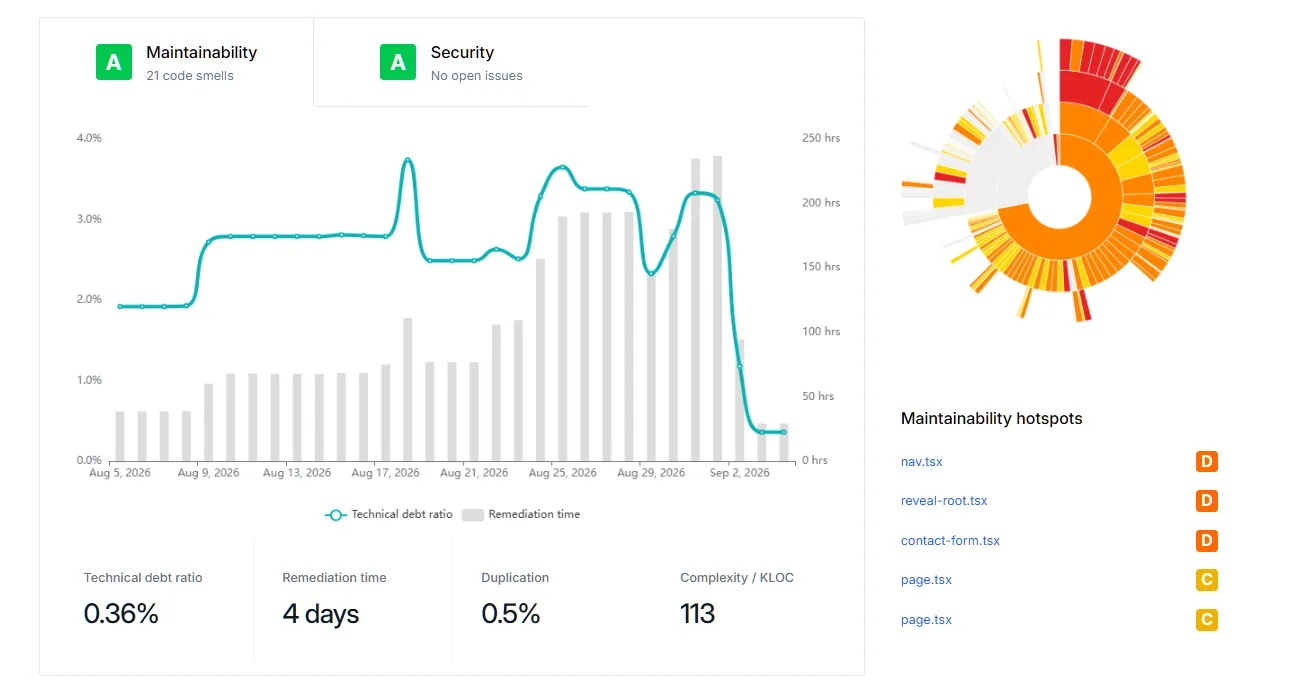
There's a comfortable answer here and a true one. The comfortable one is that there's barely any. The true one is that I use Qlty, an external analyzer, and it's the one that told me there was, and looking closer it turned out the five worst-scored files weren't the site's actual code: they were the contrast census, two content registries, and two guardians. Two readings come out of that, both true at once:
- Qlty pointed straight at the real blind spot, because its worst-scored file was exactly the one that had broken twice in silence. That doesn't get silenced, it gets fixed.
- And at the same time it penalized the two content registries for structural duplication between Spanish and English, which is exactly the property a guardian in this repository exists to guarantee. Scoring what's imposed on purpose as debt tells you nothing.
Out of that came the rule I wrote down to keep myself honest: in that file, exclusions are based on what a file is (generated data, parallel per-language content), never on what a file scores. Silencing an uncomfortable finding would have turned the report into the same meter that passes on an empty list, which is the mistake I've made the most times in this project.
The tests arrived when the logic did
For a while this repository had no tests, and it wasn't an oversight: it was a decision that held until the day the first function with real branching conditions showed up. It showed up with the contact form, which validates what a stranger types, composes an email header, and decides whether a submission is accepted.
That, and nothing else, is what gets tested: validation, header sanitising, and the send decisions. And it gets tested on the email that goes out, not on the instructions handed to whatever sends it. The message is generated in full, with its encoding and its quoting, because the hole just above was precisely a reasonable-looking header that ended up carrying two addresses: asserting that the instructions were right would have waved it through again. They run on every PR and they have their own planted failure in the verifier of verifiers, because a green suite and a suite that tests nothing look far too similar.
9 of 12 · 7 min
09 — Accessibility
09. AA is only the floor, AAA is the target
9 of 12 · 7 min
I already had the first version running, a brand created, a Design System keeping it consistent, and even a Brand Kit for using it. But something was missing that I knew from the start this page had to include: excellent accessibility. Not just because everyone has to be able to reach all the content, but because thinking about accessibility, whether you notice it or not, improves the experience for every user, not only the ones who need a minimum standard.
Meeting WCAG AA wasn't the goal: it's a guaranteed floor. From there I work toward AAA wherever it's achievable, in both themes, at rest and also while the cursor is hovering, which is where almost nobody measures.
The European Accessibility Act doesn't apply to a personal website, only to e-commerce, banking or transport, but I do follow its technical reference standard: EN 301 549, which points back to WCAG. The full reasoning is on the accessibility page.
Five points get inherited, four stay manual
The checklist is nine points a page has to clear before it counts as closed, and I already mentioned four stopped needing manual checks the day the piece started handling them. The ninth, the skip link to the content, comes from the page layer and a guard checks it on every change. The other four stay manual and will keep staying manual, because they depend on the content and no component can supply them:
- Heading hierarchy, with no skipped levels.
- The breadcrumb on every internal page.
- Nothing encoded by color alone.
- Text alternatives.
That split is the only reason a nine-point checklist is still being met in month fourteen: nobody sustains nine manual checks, but four, yes.
Inheriting it isn't always enough either, and the video that opens the About page is the example. It plays once and stops on its last frame. When the browser reports that whoever is watching prefers less motion, it isn't that the video holds still: it's that it never gets downloaded, and a still image is served instead. Switching the animation off and leaving the file downloading would have met the rule just the same, and would have charged a megabyte to the one person who had explicitly asked for the opposite.
The color rule I'm proudest of
It isn't a component. The secondary text's gray is calibrated against the page's background, and only against that. On top of a card, an inverted band or an overlay, that same gray falls short. The rule's first version said "recalculate it when you change surfaces," which is a rule you have to remember, meaning a rule that gets broken. The second version doesn't need remembering: every surface declares its own dimmed value by mixing the text toward whatever background sits beneath it, and the call site always writes the same thing.
And here's the first failure, because the good rule had a hole that took me a while to see. A surface doesn't only change by class: it changes by state. A card that lightens on hover is changing its background, and my layer had no idea, because hover compiles to a different selector. For a long stretch, cards that passed comfortably at rest fell below target on hover. No scanner caught it. What caught it was asking myself why I'd measured eight pages and not twelve.
The times the meter measured something other than what I thought
And the rest isn't that the site fell short. It's that getting there meant fixing the measuring instrument itself more times than I would care to count, and every time the result read exactly like a pass.
On color. This brand's cyans fall slightly outside the color space the screen actually uses. The browser clips them when painting, but if you ask it for the value it hands back the original, with negative components. Measuring contrast on that is measuring a color nobody has ever seen: perfect numbers for a color that doesn't exist.
On coverage. The census that walks the page and measures every color pair broke twice, both times silently, both times returning an empty list. An empty list of violations and a flawless site read identically in a report. The second time, it was hiding a real violation. Since then the census publishes how many rules it indexed and how many pairs it measured with them, because what you have to check on a verifier isn't what it found: it's how much it looked at.
On threshold. The standard doesn't ask the same of small text as it does of a headline: past a certain size, the bar drops. I was scoring everything against the small-text bar, so I published four violations where there was really one. A misapplied threshold invents findings just as badly as an uncalibrated meter, and it's more expensive to undo, because nobody doubts a report that brings bad news.
On scope. The fourth one is a different kind, and that's why it taught me the most: the instrument wasn't broken, it didn't exist. Everything it measured was text against its background, and there's a second requirement almost nobody remembers: a control also has to be recognisable as a control. The border of a form field, which is the only thing telling you where to type, has a bar of its own. Mine sat at less than half of it, on every neutral control on the site, and had done since the first version. Nobody caught it because the automated scanner doesn't check that rule, my own census measured something else, and each link in the chain delegated to the next, so the whole chain ended somewhere nobody was standing. The name I gave it helped too: “contrast pair census” sounds like it covers everything. Had I called it “text pair census”, the gap would have been visible on day one.
On criteria. The fifth one landed the day after I fixed the fourth, and it is the one that stings most: the instrument was not broken, and it was not missing. It measured, it published its number, and the number was true of what it measured. What was wrong was what it had decided to look at. It counted as a control anything you click that also draws itself a border, and the section index on this page draws its own inside a piece within it, so it neither counted as a control nor got looked at as a border. Twelve invisible controls, eleven of them below the bar, carrying the very number I had just corrected everywhere else. And the pass measured without scrolling down the page, so that index was not even there when it went to measure it: two independent reasons for the same zero, and either one was enough. Now the pass says how many controls it finds through that door, so a zero cannot look like a pass again.
The layer that can't be automated
I walked the entire site with NVDA, a screen reader, and it caught things that break no rule at all and that no scanner could ever flag: a key that didn't close what it looked like it should close, a change that happened with no announcement to someone who can't see it. What it found is published on the site's own accessibility page, named and dated, alongside what I haven't fixed yet. An accessibility statement that only says what's compliant isn't a statement: it's a cover page.
10 of 12 · 4 min
10 — What an AI reviews
10. What an AI reviews, and what it doesn't
10 of 12 · 4 min
This site was built working with an AI, so the honest question isn't whether it helps: it's what it catches and what it doesn't.
Who decides
One note before going on, because it affects how everything above should be read. When this article says "I decided," the decision is mine and I own it. But almost none of them were made in silence: they got discussed in conversation, and a good part of the objections that changed my mind came out of that. What doesn't get delegated is the decision itself, or the judgment it's weighed against afterward.
What it catches: what exists
A badly written pattern, an inconsistency between two files, a duplicated value, a function that can be simplified. Ask for a code review and you get one, and it's usually better than mine at eleven at night.
On top of that I've built a handful of my own routines, written by me for this project, that fire at a specific moment instead of whenever I happen to remember:
- On closing a stage, a technical review of the whole repository, seen with the eyes of an outside developer looking at it for the first time: debt, gaps, and where the docs and the code stopped saying the same thing. It ends by proposing concrete tasks, not a report to file away.
- Between stages, a review of the method itself: the gates and how many of them depend on remembering, how expensive it is to start a session, whether the guardians know how to fail, whether the board still tells the truth. It runs in the gap between two stages and not when one closes, for a reason that took me a while to see: the scaffolding has to go up before the things it needs to hold exist.
- Before a big visual change, a design review that looks at two different things: whether the system is being followed, and whether the brand is coming through. It gets checked on screen, not by reading the code, because a class can be misapplied without throwing a single error.
- When a new piece is built, a routine for publishing it on the page that documents the system: which existing section to compare it against, how a section is put together, and what subsections it needs. It exists because the rule to publish them had been written for months and was broken twice in a row: what was missing wasn't the rule, it was something to compare against.
- On closing a session, a documentation routine that checks what needs updating and updates it, including the operation that always gets forgotten: retiring what's stopped being true.
- And one for the résumé, which regenerates both PDFs from the single source, checks they still fit on two pages, and leaves the link ready. It exists because the first time I changed a fact about my career, the site stayed current and the PDF didn't.
- And a seventh that is the exception, which is why it's worth mentioning: three of these checks need the site up and running in front of them, so there is no editor event to hang them on. They're packaged into one routine you invoke by hand. If something can't be tied to an event, at least tie it to one command instead of seven steps you have to remember in order.
None of the seven is a prompt I rewrite every time. They're versioned instructions inside the repository, and that's why they improve: when one fails, the file gets fixed, not the next conversation.
What it doesn't catch: what's missing
And on this project, what's missing has always been the expensive problem.
That's why this repository's checkers are written backward from how they're usually written. They don't look for the bad pattern: they look for the absence of the good one. They don't ask "is there a low-contrast color anywhere?", they ask "is there any color pair this census hasn't measured?" And all of them end up reporting how much they reviewed.
It's happened to me five times, and the best of them was this one: I found out that the layer that verifies wasn't itself verified. This repository's guardians check that nobody breaks the rules, and nothing checked that the guardians actually worked. Their failure mode isn't an alarm, it's a green light. Now every guardian carries a fake bad case it has to be able to catch, and if it doesn't catch it, the build fails.
11 of 12 · 3 min
11 — What went wrong
11. What went wrong, and what all of it had in common
11 of 12 · 3 min
As in any project, there have been failures here. Some were expected: shipping fast knowing it generates debt is a decision, not an oversight. Others weren't, they simply happened, and I've been fixing, improving and polishing them as I went. And since this is about opening the workshop and showing the engine, here are some of the parts I've had to replace. Putting them in order I ran into something I wasn't expecting: they look too much alike, and that resemblance is the one thing in all of this I'd carry to another team.
A rule you have to remember is a rule that gets broken. There isn't a single exception in this project's record. The rules that have held are the ones that turned into a component, a utility, or a checker. The ones that stayed written in a document all got broken at some point, including ones I'd written myself the week before.
A rule whose trigger looks at the wrong place isn't a rule, it's a note. I had it written: "if there are more than two custom icons, publish them." I checked that by looking at the icons file, which had one. The site had seven, scattered across other files. The rule was right and the condition was looking somewhere else. And the same thing happens with timing: the accessibility gate used to fire when a section closed, and by then it's already too late, because changing the height of an opening band isn't a tweak, it's a redesign. Now it also fires while the section is still being drawn.
Validate the instrument before you believe the finding. Three of mine have failed on me: a contrast meter, an icon-drawing standard, and a pair census. All three produced plausible-looking results. The only defense I've found is to start by measuring something whose result I already know: if the instrument can't reproduce that, the problem is mine, not the site's.
The same decision written in two places ends up saying two different things. Always. The version of this mistake that stung the most wasn't about documentation: it was a PDF generated from a single source that stopped regenerating. A single source prevents two truths only while it's still generating. The day the printed copy stops moving, you're back to having two.
The metric you have is not the metric that matters, and mixing them up is far too easy. For months this site had no contact form, and I argued that a click on the address was a more honest signal than a submission. It wasn't: it was just the only one I had. This mistake doesn't show its face either, because the argument sounds good; the only tell is that it justified exactly what was already built, and reasons like that are almost always written afterward.
And a sixth one that runs the other way, so this doesn't read as "unify everything": before merging two values that look similar, check they don't mean different things. I found two different corner radii on what looked like the same component and nearly made them match. It wasn't inconsistency: they were two different boxes, and one of them was just missing its name. Unifying them would have broken half the site's visual hierarchy.
12 of 12 · 3 min
12 — Closing
12. Now the good part starts
12 of 12 · 3 min
Beyond shipping that MVP version and having something to show whenever it was needed, I wanted to take the time to build this with rigor, and I think I've managed it. I'm sure you'll spot flaws: from an HR point of view, as a designer you'll probably miss some things or have fair criticisms, and as a developer something will probably have made you wince. Like I said at the start, this is a proof of judgment in how to build a product, however small. And I'm happy with the result.
But the piece that closes the loop is missing, and it's the one that gives everything above its point: starting to see data and iterate on it. How have I set that up? Let me walk through it.
Measurement starts with everything denied, not the other way round: the tag manager loads with consent set to "no" by default, so until you accept not a single analytics cookie is written. And the cookie policy isn't text copied from a template: it's a living document that says what loads today, and gets updated the day that changes.
The primary metric isn't the visit, it's the message. For months it was the click on a contact channel, because with no form that was the most honest proxy of intent I had: someone copying my address has decided something. Since the form exists, the primary one is the submission, and it's counted when the email goes out, not when someone presses the button: a click that dies on a badly filled field isn't a contact, and counting it inflates exactly the number you want to believe. Clicks on the phone and on the direct address stay as secondary. So are CV downloads, measured across the different places it's offered, and scroll depth, which is the one that tells whether the slow reader I talked about at the start actually exists. And with Clarity I'll be watching what those visits look like: what path they take, how they move through the page, anything that helps me learn from whoever's reading it.
The first goal is already covered: building this project has been a genuinely great learning experience. What I'm taking with me is the way of working underneath it: write decisions down with their why and their date, turn every rule that depends on remembering into code, and distrust the instrument before the result, especially when the result looks good.
At the start I said I wanted to open up the workshop and show the engine. This was the engine. You don't need to be a programmer to build this way: you need to decide this way, and write down why.
If that's the kind of judgment you're looking for on your team, let's talk.